

Sunday, April 17, 2011
Saturday, February 12, 2011
poster designs
I am under way on my poster designs and would like to share them with you! I have finally found a method that it giving me the results that I am looking for. They are not finished but here are two of the images that I would like to use on my posters in progress:


Lots in progress, I would love your feedback!


I did a mock up poster with one of the unfinished images to see what it would look like with text:

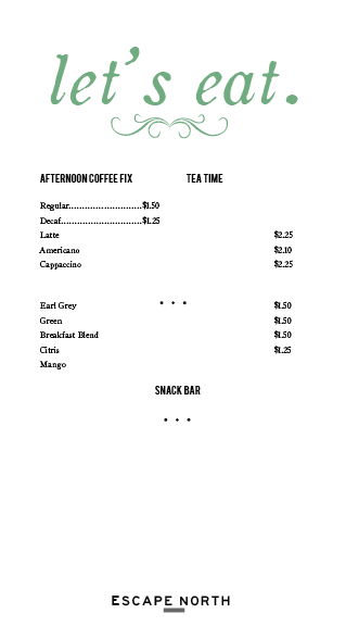
And finally, the beginning design for the menu:
Wednesday, January 26, 2011
Updates!
I have not updated my blog in a while so I would like to show the work that I ended the semester with and where I am now. At the mid semester critique, I ended by showing my critique group this poster:


They criticized this poster because they said that it looked as if it could be going anywhere and my project talks specifically about going to Northern Michigan. In addition, while I was using design elements to get the vintage feel that I wanted, they felt that it was starting to look a little "cut and paste". They expressed that I should take a few weeks to look at images and maps of northern Michigan to enlarge my current material.
Following this critique, I took the next few weeks collecting images that I have taken from up north. After I collected them, I started to merge them together into panoramas to explore the feeling of up north. A example of the panoramas that I put together can be seen here:

While I really enjoy the images and the paint-like quality of this panorama, I felt like it did not match the overall aesthetic that I am going for. The photographs, although tinted, still look too modern for the vintage feeling that I have been using in my typography. I tried to work in the photography with the text in a poster seen here:

My conclusions following this piece was that I needed to have a more hand drawn image to go along with the typography that I have and would like to be using. I developed this image:

I liked the idea here, however, instead of looking beautifully hand-drawn i feel as if it looks childish. My next attempt at an image can be seen below. I drew the image that I wanted and am in the process of working in color in photoshop, keeping the sketch quality that I want in the image.

I am really happy with how this image is coming out and I feel like it will work well with the style that I want. In addition to working on this image this week, I have also been tweaking my logo. I realized that I wanted it to be more simple and use less of the cluttered ornaments. My current logo can be seen below:

Finally, this week I have begun my train ticket which I am happy with so far.

I also experimented with letterpress this week, it was so cool! Lots going on and I finally feel like I am moving in a good direction!
Monday, December 6, 2010
week 11
This week I moved away from logo design and focused on moving back in time and trying to create a vintage 1920s feeling in my designs. I was limiting myself too much with the logo design and I felt that I needed to be able to just play around with other design elements. I created two beginnings of posters, which I plan on adding more to. I was interested in exploring design elements such as swirls, banners and other decorative elements which based off of my research was typical design during that time. As a put these elements together, I started to creative a mood, which to me felt dated and vintage- a feeling that I would really like to have in my designs. In addition, I kept my designs to a limited color palette- so far they are black and gold. Unlike the logos that I had done before, this color choice felt more sophisticated. Finally, I am also starting to get the elegant feel that I have been trying to achieve. I am excited with where my designs have started to go. I cant wait to turn them into a whole promotional poster design which is coming next! 

Designs done this week:


Work done this week: New poster designs (8 hrs), research in "New Vintage Type" (2 hrs), Created presentation for mid-review (3 hrs).
Sunday, November 21, 2010

My concern at this point that was raised during the critique on Thursday, was that I am getting too far away from the feeling of up north. Questions were raised such as: what types of words would you use to define up north? What is the font communicating? These questions made me question whether I should be gearing my logo more towards the "feeling of northern michigan", the real essence of up north or sticking to the vintage charm. Can I have both? I would like to.
The biggest thing I got from the critique..my logo should reflect an experience, just like the train.
Goal for next week: get peer critiques...what should stay, what should go. Ask what feelings people get from the existing logos. Also, come up with KEY words for northern michigan and make sure that they are reflected in my design.
Work done this week: Library research and reading (3 hrs), logo work (5 hrs).
Sunday, November 14, 2010
Week 10: Logo Continued
This week, I continued to work on my logo. My goal was to try and work with lettering and fonts that were much less delicate than the ones I had worked with last week. However, in many cases I think the logos I designed look far too contemporary and are starting to move away from the style that I would like. The one logo I am still drawn to in this grouping is the one second down in the left hand column, although I am not sure if it is readable as an "N" and an "E". I am happy that I went down this road because now I know that the logos I did last week are much more the style I am looking for. I am still working hard towards a logo that gives off a "special event" feeling. I will continue to work on logos and plan to bring many more variations to the critique on Thursday to ask opinions from the class.
The logos designed this week:

In addition to my logo, I will start to sketch ideas for my brochures such as how I want it to be folded and what I want the outside shape to take. I think this will help me to move forward and continue to build an aesthetic for the train.
Work done this week: Reading (2 hrs), Logo Design (3 hrs), Online invitation research (1 hr), Book research for logo design (1.5 hrs)
Sunday, November 7, 2010
Week 9: Logo
This week I made my first attempt at logos. At this point they are just basic sketches. In my logo designs, I incorporated the hand written "the escape" with other fonts that I felt demonstrated a retro feel. I also played around with using different shapes as borders to the text to mimic a vintage photo frame. My first attempt logos can be seen below:

I think that I learned a lot from these first designs. First, I realized that while the hand written text I made may be beautiful, it may also be too delicate for a logo and hard to read. In addition, this text looks a little too feminine. As discussed in a mini critique on Thursday, I should remember that the train is a heavy machine too. From this discussion, I have some logo ideas which could remain delicate while having more power than the current designs. I know that my logo needs to stand alone. I am now still wanting to draw my own font but keep it more simple and less delicate. Further, I would still like to work with the framing around the text making it look like a stamp. Lots of trail and error and work a head of me! More logos to come...
IP work done this week: Read design books (1/2 hr), worked on logo designs (4.5 hrs), Meet with design group and Seth (1/2 hr), discussed work with peers (1 hr)
Subscribe to:
Posts (Atom)