I am under way on my poster designs and would like to share them with you! I have finally found a method that it giving me the results that I am looking for. They are not finished but here are two of the images that I would like to use on my posters in progress:
I did a mock up poster with one of the unfinished images to see what it would look like with text:
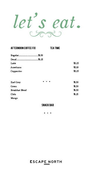
And finally, the beginning design for the menu:
Lots in progress, I would love your feedback!


Alana,
ReplyDeleteThis is looking great! The train looks so much better now, and I like the splash of color on it (though the red doesn't jive with the 1920s French feel you had been going with before). I think the dining car picture is working well with different splashes of color too. The advertisement picture is less interesting to look at because the highlight colors (blues, greens) are missing. I'm not sure that you have the right colors for the outfits and the blue outside the windows to get the feel that you want quite yet, but it's really coming along. On the menu I'm a bit confused about the "Afternoon Coffee Fix" and "Tea Time" columns. It seems like they are competing for the headlining title, or that Tea Time is supposed to have separate info underneath it and doesn't. I'm guessing it was just supposed to go further down above the list of teas? The Escape North logo on the bottom is working really well too. Looks like somebody's on a roll! Keep it up!!
Erica
I really enjoy the typography that you are using in your pieces. It is a nice combination of vintage and modern and is very delicate, sophisticated, and clean. I think you have made a lot of progress with the images since the watercolor I saw last time. I think this style goes quite well with the overall style of your brand.
ReplyDeleteOn the menu is the title "Tea Time" supposed to be below Cappucinno? And I think all of the prices should be lined up in the same column.
I am wondering what other pieces will be included in your project besides tickets, posters, and menus. Are you making brochures, a website, etc.?
Hey Alana,
ReplyDeleteIt's exciting to see what you've been working on. You are definitely creating a feel. I think the interior is working better than the exterior at this point. The fire engine red looks too modern--maybe a combination of sage/olive green, steel blue, brown and tan??
I like the type on your menu, too, and the layout looks very elegant. I think it meshes well with the interior space. I do have a question and comment, though:
1. Will there be food on the menu too? It's titled "Let's eat" but there are only drinks.
2. Citrus* is misspelled.
I'm looking forward to this week's post to see what you've done!